


Top 6 Web Design Mistakes to Avoid
Have you ever wondered why companies like Google, Amazon and Apple are so successful that their competitors would rarely have a chance to compete against them? The answer is that because they make sure that every of their products delivered to their customers are world-class user experience where repeat sales are guaranteed. Same applies to websites that user experience is also a key to an online business. You need to know the cost of a poor website will have a big negative impact on your business, so in order to avoid these mistakes, let us take a look at some web design mistakes to avoid.
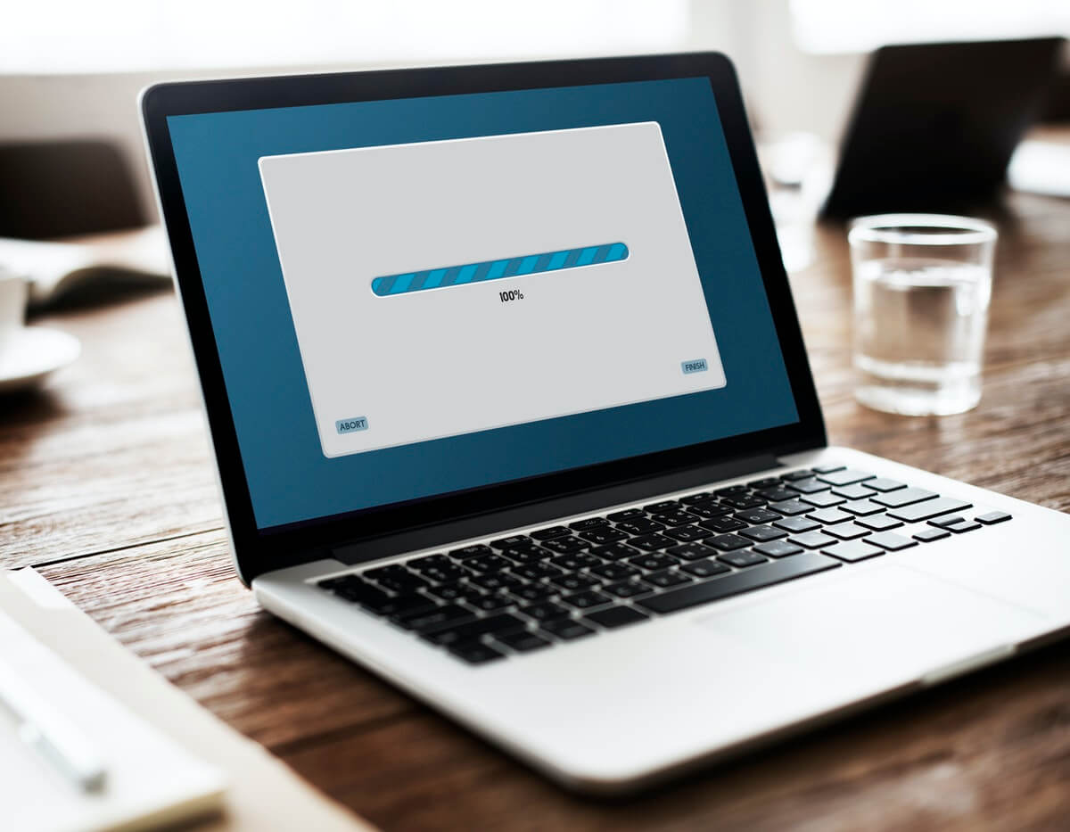
Slow Loading Speed
A site loading speed will determine whether a visitor will stay or leave your website. Do you know that an ideal loading speed is less than 3 seconds. Research found out that people will abandon the site when they wait more than 3 seconds. People are impatient so you must make sure to speed up your site to keep them on your site.
Keep in mind that the first 3 seconds is your golden chance to keep your visitors on your site. Try to find out what is causing your website to have such a slow loading speed and fix it again.
Look and Feel
This basically refers to the overall design of the website. Here we refer to the homepage as well which is typically the first page that users see when they land your site. Your homepage should showcase your brand’s value and give users the feeling of “wow, this is what I want”.
Don’t fill your website especially the home page with full of sales advertisements that make users feel you are doing sales more than addressing what they need. Bear in mind that your website is designed to address your customers’ needs and not make a strong pitch for selling.
Lack A Clear Call To Action
The end goal of the user experience on your website should be to create a conversion by having a user get in touch with you. To have this done, your website must include a clear call to action for users to find and reach you.
Information like phone number, address, email or any other forms of contact should be stated clearly on the site for the ease of users. There must be a clear call to action for users to take action to reach you. Otherwise, you are probably losing your potential customers by letting them to your competitors.
Not User-Friendly
When your website does not offer an user-friendly experience to the visitors to your site, it might be a big problem to you.
Imagine that when you put all of the items you like into your shopping cart and are ready to check out for payment, the website requires you to do a registration before you proceed to check out. What would you feel? Feeling frustrated right?

You would even abandon the site and decide not to purchase from this website again. This is a clear example of not being user-friendly where the registration is seen as unnecessary or even a barrier to checkout by the visitors. Hence, try to make users’ online experience as easy as possible.
Unnecessary Complexity
We understand that sometimes designers might have a lot of creative ideas and want to present the site in a more creative way to the users. However, we have to consider from customers’ perspective whether an additional design will add any difficulties to the users experience.
Instead of making the website overall design to be more creative, these additional ‘creative’ designs would actually make it more complex for users to use. Thus, a simple and straightforward website is more preferred where the brand’s value can be presented nicely throughout the flow of the website and visitors can get the information they need easily.
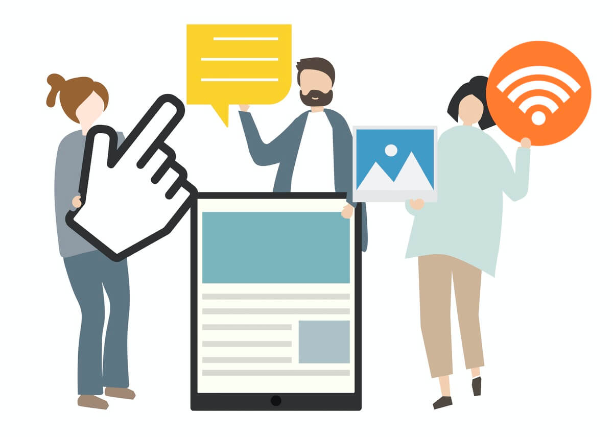
Lack of engagement
Your visitors should be able to engage with you when they are on your site. It works the best when your website can provide immediate support whenever your visitors have any enquiries.
People will appreciate your good service when your customer service is 24/7 there for them to help them solve their questions. Act like a human, don’t act like a robot. Even if you are using automated responses, try to answer in a more human tone.
One way to improve user engagement on your site is to include some interactive images, gif or videos. Besides, you should enable social media plugins like social media share buttons, social logins and social comments on your site. Social media share buttons allow users to share your blog posts on social media like Facebook with their friends which would also help to increase your brand awareness on social media.
Conclusion
After reading this article, can you figure out what are the top 6 web designs mistakes designers always do and which one is your website having now? If you found out your website has experienced any of the mistakes mentioned above, fix it as fast as possible to avoid any costs incurred at the later stage. Don’t forget to always have a track on your website to ensure it is in a good condition to serve your customers’ needs.